Pop Art
How Did I Start?
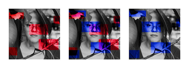
To begin I just scrolled through different Warhol pieces to look at the way he utilized colors. Then I decided to go with the idea of playing with shapes and making look like pictures in newspaper. For the one of Molly I wanted to use different cut-outs to portray different parts of her face and when doing the one of Jenna I wanted to use shapes to bring attention to her faces and other parts of the photo.
Inspirations
I didn't really take lots of inspiration from really famous pop artists, for me it was mainly taking different parts of what I like about pop art and incorporating it into my own work in a way that's aesthetically pleasing to me. I like the way Warhol shows repetition with both colors and images and I like the comic book feel of Lichtenstein's work. That's how I made some decisions but the way I did things and laid everything out was because I wanted them to fit my personal aesthetic.
Tools Used
In photoshop I used the halftone dot filter to make it look like it had been printed in a newspaper and over that layer I adjusted the layers to have more contrast. After that I played with color combinations and the different ways I could make the layers I had set work as different overlays. After I had everything looking how I wanted them to I spent a while moving my shapes around to find a layout that made me happy because I'm super picky about where things lay. In the one with Jenna I decided to incorporate the repetition that Warhol tended to use but in my own way. The one with Molly I wanted to almost look like a poster so I changed the crop and placement of everything to fit the more rectangular shape I needed.


Comments
Post a Comment