Photoshop Challenge 1
Thoughts and Inspirations
So, once I saw the picture and was told what the challenge was I wasn't entirely sure about what I wanted to do to edit the guy in the picture. At first I was going to go ahead and stick with the idea of including nature in the edit but I eventually decided against that after looking at some other creators work. The photoshoot I chose to take inspiration from is the Gaytimes cover with Milk, who is a drag queen I draw lots of inspiration from. I chose this cover shoot because of the way she did her makeup for this particular shoot. The way it's done is heavily line based and it has a very bright and graphic look to it. So, I took the line art aspect from that but, stuck with my darker and more muted aesthetic.
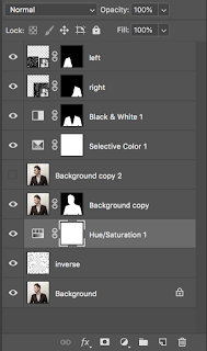
Overall I ended up with nine layers, six of which had layer masks. Two of those layers were used to put a pattern I made in another photoshop document on the two sides of his frayed blazer. I adjusted the layers with the pattern to overlay layers so it wouldn't look like digital art on top of where a blazer once was. I then added a black and white layer mask over the blazer so it would no longer be dark brown since I want the overall aesthetic to be more grayscale. I have a selective color layer above the original background layer and an other layers that have him in it so that I make his skin look like it had a purple tint to it. The other layers I used are just layers that have different versions of the idea I had so that I could turn them off and on in attempts to choose one to turn in.
Am I Happy With the Outcome
I don't know if I'm necessarily happy with the outcome but I don't hate it that much. I'm not too great at making my ideas a reality but compared to most of the things I produce this one looks really good. My favorite part of the entire process was making my pattern of one line faces since I had a chance to really try out the Wacom tablet and I enjoy drawing occasionally.


Comments
Post a Comment