The Makings of My Logo
The Process
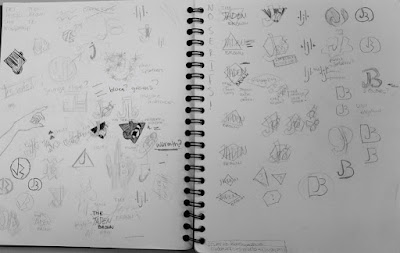
 To begin with we took notes on. the meanings of different colors and shapes to help us make sure we were using the right symbols to portray ourselves. After this was the sketching which took forever. I mean the sketching itself didn't take forever, it was the coming up with ideas to sketch that was an issue. I consider myself a creative person and all but this was a difficult task. After about two hours of staring at my sketchbook and listening to music I finally had some ideas coming me. Once I had about two pages full of sketches I was ready to choose a couple of my favorites. Me being the indecisive person I am struggled to choose one logo to take to Adobe Illustrator. After wasting a whopping 10 minutes I chose one. Then it was time to bring the logo to Illustrator. To begin with everything was in black and white so that we could make sure everything looked how we wanted it to. So I ended up with a few very similar variations. After I chose the one that was the most pleasing to look at I started adding color. Playing with colors was the best part of this project simply because it was really easy. Then it came time to choose what colors were going to make my final logo.
Why I Chose What I Chose
 I wanted to portray that I'm kind of well rounded so instead of a perfect closed circle it's not closed and not a perfect circle. When choosing the colors for my logo at first I was just playing around with colors I liked then I had to think about the meanings. I ended up with three final options all with cooler colors. I chose to go with cool colors because I feel like I want it to say that I'm a calm person. I was being very indecisive so I asked my friends which one was best for me.


Comments
Post a Comment